KEY POINTS FROM THIS ARTICLE
— One of the most useful tools that the Crystal Ball employs on a regular basis is Dave’s Redistricting App, which helps us make sense of redistricting and includes a plethora of data.
— Using some of DRA’s newly-released data, we are looking back at how the 2008 election compares to 2020 by congressional district.
— Despite doing several points worse nationally than Barack Obama did in 2008, Joe Biden performed better than Obama in nearly half (211) of the current 435 House districts.
— Our home state of Virginia illustrates several of the broader national swings that have taken hold since 2008.
— Most districts cast more raw votes in 2020 than they did in 2008, though there are some interesting exceptions.
From 2008 to 2020
One of the best tools we’ve had to analyze elections at the Crystal Ball over the years has been Dave’s Redistricting App (DRA). The premise of this open-source program, which has been around in some form or another for the better part of two decades by this point, is that users can “do their own redistricting.” Towards this end, DRA provides precinct-level election and demographic data.
A couple of weeks ago, to the delight of all of us who use the program, DRA announced that for most states, it now includes presidential data for each cycle since 2008 for all of the nation’s current congressional districts. So naturally, we jumped in feet first. What follows is the first of a multi-part series that is based on DRA’s data.
To begin, we are looking at how things have changed since 2008, the earliest presidential election for which DRA has comprehensive data.
Map 1 considers the swing between the 2008 and 2020 elections using the current district lines. In blue districts, Joe Biden’s margins were better than Barack Obama’s, while the opposite was the case in the red districts.
Map 1: 2008-2020 swing by congressional district

(Click on the map for a larger version)
Something to consider while interpreting Map 1 is that Obama’s national margin in 2008 was several points better than Biden’s in 2020. In 2008, Obama won the two-party presidential vote by almost 7.4%. A dozen years later, Biden did about 2.8 percentage points worse, defeating Donald Trump by a little more than 4.5%.
So, with that context, it shouldn’t be too surprising that there are more red districts on the map—although there are fewer than we may have expected. Despite the varying degrees of Obama and Biden’s wins, the movement of the districts was fairly even: from 2008 to 2020, 211 districts swung more Democratic while 224 swung more Republican. Additionally, 38 districts got redder over that span but by less than the roughly 2.8% national shift to the Republicans (these districts make up the majority of those that are shaded the lightest hue of red).
Generally, the districts that moved most to Republicans since 2008 form something of a “U” shape: this group begins in eastern Montana, dips down into Arkansas then follows the Appalachian Mountains up to northern Maine. Standout regions for Democrats include the Mid-Atlantic, Texas’s metros, California, and much of the Mountain West.
We’d note Nevada as a state that possibly looks redder than it “should” be on Map 1. As the state was hit especially hard during the onset of the Great Recession, Obama’s numbers—he was, famously, the “change” candidate in that election—were likely unnaturally high there in 2008. On that same token, Arizona, as the late John McCain’s home state, is probably a little bluer than it otherwise should be. In an article last year, we found that in 2008, Arizona had its most pronounced GOP lean, relative to the national vote, this century, which spoke to McCain’s appeal there.
Sticking to the Mountain West, Utah has been a state that, for several cycles, was challenging to get a good partisan “baseline” for: though it is overwhelmingly red, it went from having a GOP nominee who seemed to fit it perfectly in 2012 (Mitt Romney) to having one nominee who, well, didn’t (Trump). Even as Map 1 removes Romney’s performance from the equation, some considerable GOP erosion is evident. Though Trump carried the state 57%-37%, he underperformed McCain by at least 5 points in each district—in Provo’s (Brigham Young University) 3rd District, Trump fared 12 points worse.
So Utah, taken with Eastern Idaho’s 1st District, seems to confirm the coolness that some Mormons have expressed to a Trumpier GOP (although we are not expecting Democrats to carry the state anytime soon).
We would also add that UT-4 had the highest percentage increase in votes cast from 2008 to 2020. Over that span, it went from casting 188,000 votes up to 343,000, which accounts for an 83% increase. While the election mechanics almost certainly played a role—Utah became a virtually all mail-in voting state during that time—it seems likely that this could be attributed to newer voters. Namely, the transplants that have been steadily moving to this picturesque area are probably just less conservative than most Mormon voters.
A last note on Utah is that Split Ticket’s Max McCall recently wrote an insightful piece on “pendulum counties,” of which the Beehive State has several. His analysis pairs nicely with what we’ve found here.
If Arizona offers some evidence of a pro-McCain regional effect, Wisconsin could be considered the poster child for Obama’s appeal in the Midwest. Since 2000, Obama has been the only nominee of either party to carry the state by double-digits: he did so by a 56%-42% vote in 2008. As in neighboring Michigan and Minnesota, the state’s three most geographically vast districts swung more than 20 points more Republican from 2008 to 2020. But a few weeks ago, we flagged Trump’s apparent primary weakness along Interstate 94, which runs from Milwaukee to Madison. Biden, while doing 13 points worse than Obama statewide, actually did a little better in District 4 (which includes Milwaukee and several of its more affluent, closer-in suburbs), and fared only slightly worse in Districts 2 (Madison) and 5 (which includes Waukesha County, a longstanding suburban Milwaukee GOP bastion that has gotten less red in recent cycles).
Now, for the superlatives. The district that saw the largest shift, in either direction, was Ohio’s 6th, which covers Youngstown and includes a selection of more rural eastern counties. In 2008, the current OH-6 would have been slightly left of the nation, giving Obama a 7.8% two-party margin. But by 2020, it swung nearly 37 percentage points rightward and gave Trump a 29-point margin. All told, four other districts saw redshifts that were greater than 30 percentage points—and, like OH-6, they all touch the Ohio River. They were, in descending order of the swings, IL-12, MO-8, IN-8, and WV-1. As a bit of an aside, OH-6 will host a special election on June 11. Last month, state Sen. Michael Rulli (R) won the GOP primary, which is now tantamount to election there, thanks to his overwhelming showing in the Youngstown area.
On the other extreme, the most Democratic-moving district came in a state that has been trending in very much the opposite direction of Ohio. Georgia’s newly-drawn 13th District wraps around the eastern edge of the Atlanta metro area. In 2008, it gave Obama just a 12.5-point margin. By 2020, it moved more than 28 points more Democratic. Gwinnett County, which makes up about 47% of the district, was the main, though not the exclusive, driver of this movement. In 2008, the Gwinnett County part of the new 13th gave McCain a 52%-47% vote—a dozen years later, Biden carried those same precincts 64%-35%. Despite considerably higher turnout (both nationally and in Georgia) in 2020, GA-13 was one of just 40 districts where Trump (104,145) got fewer raw votes than McCain (114,263)—see more on this dynamic below.
If proximity to the Ohio River is the defining feature of the most heavily GOP-moving districts, the common denominator for the five most pro-Democratic shifting districts is their locations in southern metros. After GA-13, the four most Democratic-moving districts were (again, in descending order of the swing): VA-11, TX-38, GA-6, and TX-37—each got more than 20 percentage points more Democratic than they were in 2008. All are deeply Democratic in general elections except for TX-38, a western Houston seat that first appeared in 2022. Though we don’t expect Rep. Wesley Hunt (R) to lose much sleep over his reelection prospects this year, this Trump+18 seat might become more of a legitimate Democratic target by the end of the decade.
Something that, at least at first glance, came as a little bit of a surprise to us was that, even though Biden had weaker support from Black voters than Obama did, the recently-drawn majority minority districts in Alabama and Louisiana swung Democratic. But each district also has a sizeable bloc of non-Black majority suburban precincts that shifted leftward. So while many of the >90% Black precincts in these districts fell to something like 90% Biden from 97% Obama, those other precincts helped to paper over that slippage. This made those Alabama and Louisiana districts stand out compared to other racially comparable Black Belt seats—such as MS-2, GA-2, and SC-6—which have less of a “suburban” makeup.
We should say that Louisiana, as things stand now, is a bit of a question mark—a panel of federal judges threw out its map earlier this week as an impermissible racial gerrymander. But if courts opt to simply clean up the erose lines that the legislature drew, we suspect the same basic dynamic could hold.
A look at home
In this next section, we’ll make a detour back to our own state of Virginia, which, when it comes to movements since 2008, has a little of everything. We are happy to say that Elizabeth Hardin, one of our interns at the Center for Politics this semester, wrote the analysis that follows. Map 2 basically considers the same data as Map 1, but we’ve zeroed in on only the Virginia portion. As the table in Map 2 shows, to get a more comprehensive analysis, Elizabeth’s write-up includes a few data points from years in between 2008 and 2020.
Map 2: Virginia change from 2008 to 2020
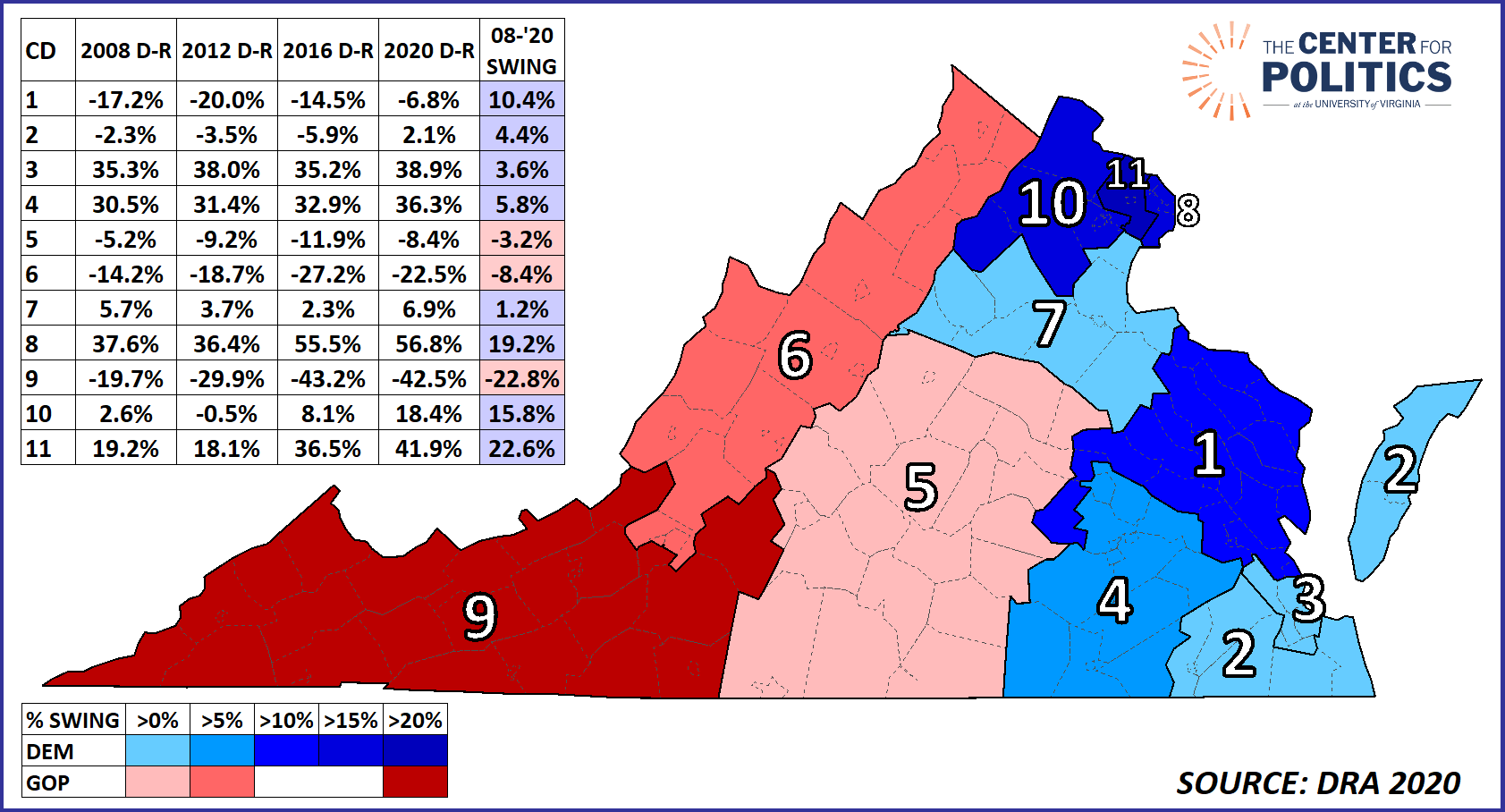
Note: As with Map 1, Map 2 considers two-party totals.
Virginia, a state that consistently voted for Republican presidential candidates in the latter half of the 20th century through 2004 (excluding the obvious outlier of 1964), is now dependably blue in presidential politics. District-level trends, however, indicate more complexity to the state than meets the eye.
In the House, Virginia is split almost evenly between Democrats and Republicans, with six representatives being Democrats and five being Republicans. In presidential elections since 2008, most of the state’s current districts have voted straight party—in other words, the blue areas have stayed blue, and the red areas have remained red. The two exceptions to this have been the pair of Districts 2 and 10. After being a single-digit Republican-won district for the 2008, 2012, and 2016 cycles, the Virginia Beach-area 2nd District gave Biden 51% of the two-party vote in 2020. VA-10, which is centered in Loudoun County, began as a light blue district in 2008, barely backed Mitt Romney in 2012, but has since voted more Democratic than the state overall.
Up in Northern Virginia, the sharp blue swing has hardly been limited to the 10th District. On the note of intensifying party swing, the Northern Virginia area (Districts 8 and 11) has experienced a noticeable blue trend (even for Northern Virginia). As alluded to earlier, VA-11, which could be considered the “Fairfax County district,” was second only to GA-13 nationally. In Obama’s two elections, he would have carried the 11th by less than 20 points, but it voted against Trump in 2016 and 2020 by a whopping 36.5% and 41.9%, respectively. VA-8, which includes Alexandria and Arlington, was much bluer to begin with, giving Obama margins of over 35 points both times. In the two more recent elections, the Democrats have carried the 8th by more than 55 points.
On the other end of the state, a similar trend in the opposite direction can be seen in Virginia’s 9th district. In 2008, McCain carried the southwestern VA-9 by less than a 20-point margin. By 2016, Trump had more than doubled that advantage, carrying it by 43 points, and lost only a little ground there in 2020. Though the movement has been less pronounced, VA-6, which contains the Shenandoah Valley and the Roanoke area, has followed a similar path—over the four elections since 2008, GOP margins there have gone up by about 8 points. Aside from those two Appalachian districts, the only other district in the state that became redder since 2008 was the 5th District. As the blue beachheads Charlottesville and Albemarle counties have gotten even bluer since 2008, the 5th’s Southside localities have moved sharply in the other direction. As a result, the VA-5 has been a fairly static district that usually gives Republicans single-digit margins.
Though the Biden-won, but Republican-held, VA-2 is obviously the Democrats’ most realistic target in the state, VA-1, a consistently Republican district, has become steadily less so since 2008. In 2020, Trump’s 6.7-point margin there represented a double-digit decline from McCain’s 17% margin in the district. This makes VA-1 the bluest trending Republican-held seat in the state. Part of this could be attributed to redistricting: for 2022, the district took in much of western Henrico County, which has moved noticeably against Republicans in recent cycles (last year, Democrats flipped the state Senate seat that covers the area). Despite all this, long-serving Rep. Rob Wittman (R) has continued to win by double-digit margins, though he has been sometimes mentioned as a statewide candidate, so perhaps the seat would be more competitive if open.
On the topic of open seats in Virginia: One race that should get outsized attention this year is the 7th District, where Rep. Abigail Spanberger (D) is forgoing reelection to focus on her 2025 gubernatorial run. The four-cycle toplines in the district help explain why the Crystal Ball has stuck with a Leans Democratic rating for the seat: it has been a consistently single-digit Democratic seat. That said, as with the rest of the state, there have been some changing internal dynamics within the district: as the rural counties on either end of the district have reddened, for example, the localities around Fredericksburg have picked up some slack for Democrats. So while the eventual winner of the crowded June Democratic primary cannot take much for granted in the general election, the lean of the district may give them a bit of a cushion.
Finally, Districts 3 and 4, which are both split about evenly between Black and white residents, each moved at least a few points more Democratic between 2008 and 2020. Overall, they were both similar to the Louisiana and Alabama districts that we discussed earlier: while Biden’s numbers were somewhat weaker than Obama’s in the most heavily Black precincts, some of the less homogenous suburban precincts in localities like Chesterfield County and Newport News pushed the districts bluer over the years.
Comparing votes over the years
Throughout much of this article, we’ve been talking in terms of percentage margins—while this can certainly be helpful in illustrating trends, percentages alone don’t capture everything. So with that, we’ll close with something of a “bonus” map.
Map 3 covers the same two elections as Map 1, but it considers raw votes. In gray districts, both Biden and Trump received more raw votes than Obama and McCain, respectively. As turnout was up across the board in 2020, this was the case in over 70% of districts (312 of 435). In red districts, Trump was above McCain while Biden got fewer votes than Obama. In blue districts, Biden received more votes than Obama while Trump got fewer than McCain. Finally, in purple districts—the rarest category—both 2020 nominees received fewer votes than their 2008 counterparts.
Map 3: Raw vote comparison by district between 2008 and 2020
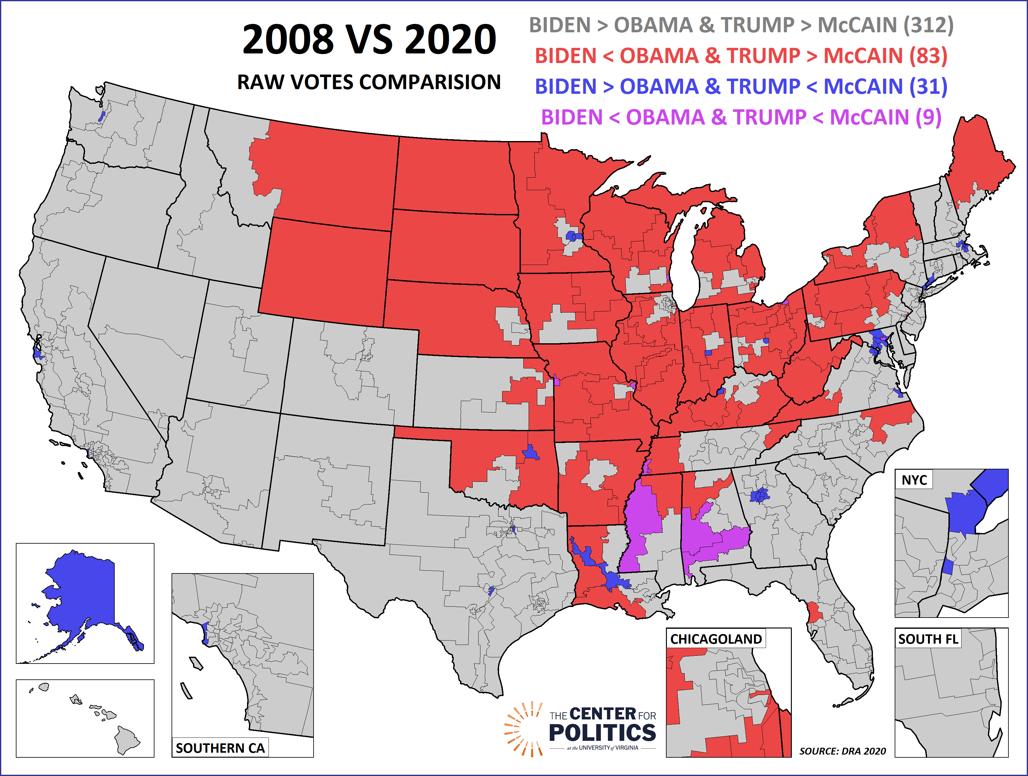
The red “U” shape that we described earlier reappears on this map. It might not be very surprising that only 14 of the 83 red districts are held by Democrats. Those 14 Democratic seats included some inner-city seats that are not remotely in danger of flipping—such as those in Chicago or Detroit—but also included several Trump-won seats—such as ME-2, PA-8, and OH-9. A rare southern seat in this category was NC-1, where first-term Rep. Don Davis (D, NC-1) is in a Toss-up race after Republicans redrew the lines last year to make his seat less favorable. Though Biden carried his redrawn seat with a bare majority, some of the coastal counties that he gained are adding conservative retirees and transplants, which likely explains NC-1’s inclusion here.
There were fewer districts in the blue category, 31. The sole Republican-held seat in this category is Tulsa’s OK-1 (we are setting aside LA-6, as the district on Map 3 would have almost certainly not elected a Republican had it been in place in 2022). Alaska is the only other Republican-leaning district in this category, although it is held by Democratic Rep. Mary Peltola. It is possible that then-Gov. Sarah Palin’s (who Peltola beat to win office) position on the 2008 GOP ticket helped Republicans there in 2008, giving them a higher starting point for comparison. But as we’ve mentioned before, Alaska does strike us a longer-term Democratic target in presidential races. Earlier, we mentioned GA-13 being a seat where Trump got fewer votes than McCain—as Map 3 shows, the same was true for the other core Atlanta seats.
Finally, there were only nine districts nationally where both 2020 nominees received fewer raw votes than the 2008 nominees. All these districts were heavily Black by composition. While the historical significance of Obama’s candidacy in 2008 may have been a factor, several of these districts have been losing population for decades.
For this issue, we’ve mostly confined our analysis to 2008 and 2020. But as mentioned earlier, DRA is a veritable treasure trove for those interested in election data. In a future issue, we’ll work in some other cycles that the site provides data for.
— Crystal Ball intern Elizabeth Hardin contributed to this piece